
WellNow Urgent Care
WellNow Urgent Care is a leading provider of walk-in and virtual healthcare services, operating across 200+ locations. WellNow offers online scheduling, urgent care visits, and telehealth options.
As the Lead Product Designer, my role was to enhance the digital appointment booking experience by reducing friction, improving accessibility, enhancing the mobile experience, and addressing usability bottlenecks.
Through quantitative and qualitative research, I identified key pain points and developed solutions that aligned with both user needs and business goals.
This case study explores how a research-driven solution helped optimize the scheduling process, website, and mobile-first experience.
The Problem: Is WellNow’s online scheduling an issue, and why?
WellNow Urgent Care provides online appointment scheduling, but user research and analytics revealed major friction points in the experience.
High drop-off rates: (50%) during the scheduling process (Google Analytics)
Mobile usability issues: Heatmaps showed low engagement and frustration signals on small tap targets and form fields.
CTA button/copy confusion: Button, call to action + overall site copy led to lower conversion rates and confused users.
Lack of rescheduling options: Patients couldn’t easily modify or cancel appointments, increasing no-shows.
Disconnect with content/marketing team: UI and brand inconsistency resulted in loss of trustworthiness.


Our customers were lost


The discovery stage: Let’s define the main problems we want to solve
Conduct user research & data analysis + competitive analysis
Analyze analytics, session recordings, & user surveys to pinpoint pain/drop-off points.
Look at leaders in the telehealth/medical industry for not only comparison, but inspiration.
Simplify the scheduling flow
Reduce the form steps and eliminate redundant fields.
Design a mobile-first experience (90% of users are mobile, coming from Google search)
Progress indicators to guide users through the scheduling journey
Improve Call-to-action messaging & navigation
A/B test CTA copy (e.g., “Schedule Visit” vs. “Schedule In-Person Visit”)
Enhance button contrast, size, and placement to improve visibility.
Address Appointment Availability & Rescheduling Issues
Enable real-time slot updates to prevent scheduling conflicts.
Advocate for a more flexible rescheduling process, balancing business concerns and patient needs.
Focus on accessibility & brand Cohesion
Ensure text contrast, alt text, and keyboard navigation met WCAG standards.
Work with the content team to improve consistency across the website and scheduling platform.
The process: my role as the lead product designer was to…
Identify usability bottlenecks through quantitative and qualitative research + perform a site-wide UX audit.
Redesign the scheduling experience to improve usability and conversion rates.
Redesign the Navigation to improve and optimize the home page experience
Ensure the platform was mobile-friendly and accessible.
Align UX solutions with business goals while presenting ideas to stakeholders.
Increasing patient retention.


WellNow scheduling user flow

Personas to help put ourselves into our user’s shoes


Don’t Make Me Think! (My goal for users)
User Research: Test Early, Test Often
Entire site audit– Dove deep into existing domain knowledge, and uncovered customer insights through extensive field research and competitive analysis (both digitally, and in-vehicle)
Conducted user tests with users and existing patients to verify and discover pain points
Identified that appointment scheduling had a high abandonment rate (partially) due to confusing copy
Competitive analysis (Carbon Health, CVS Minute-Clinic)
Fast, light, frequent testing (3-5 users)
Think-aloud protocols (verbalize their thoughts as they navigated the website)
First-click testing for scheduling copy
Navigation Redesign + Validation

New navigation to follow the rest of the Aspen brands to include hover-over drop downs, chevrons,
and opening pages in new tabs when applicable.

UXR Tree Test Results:
95% accuracy on find-ability with the new navigation.
Tested twice with 50 users total until I got at least 90%.
Results: Homepage CTA User Research Results
Version 1 of CTA Buttons


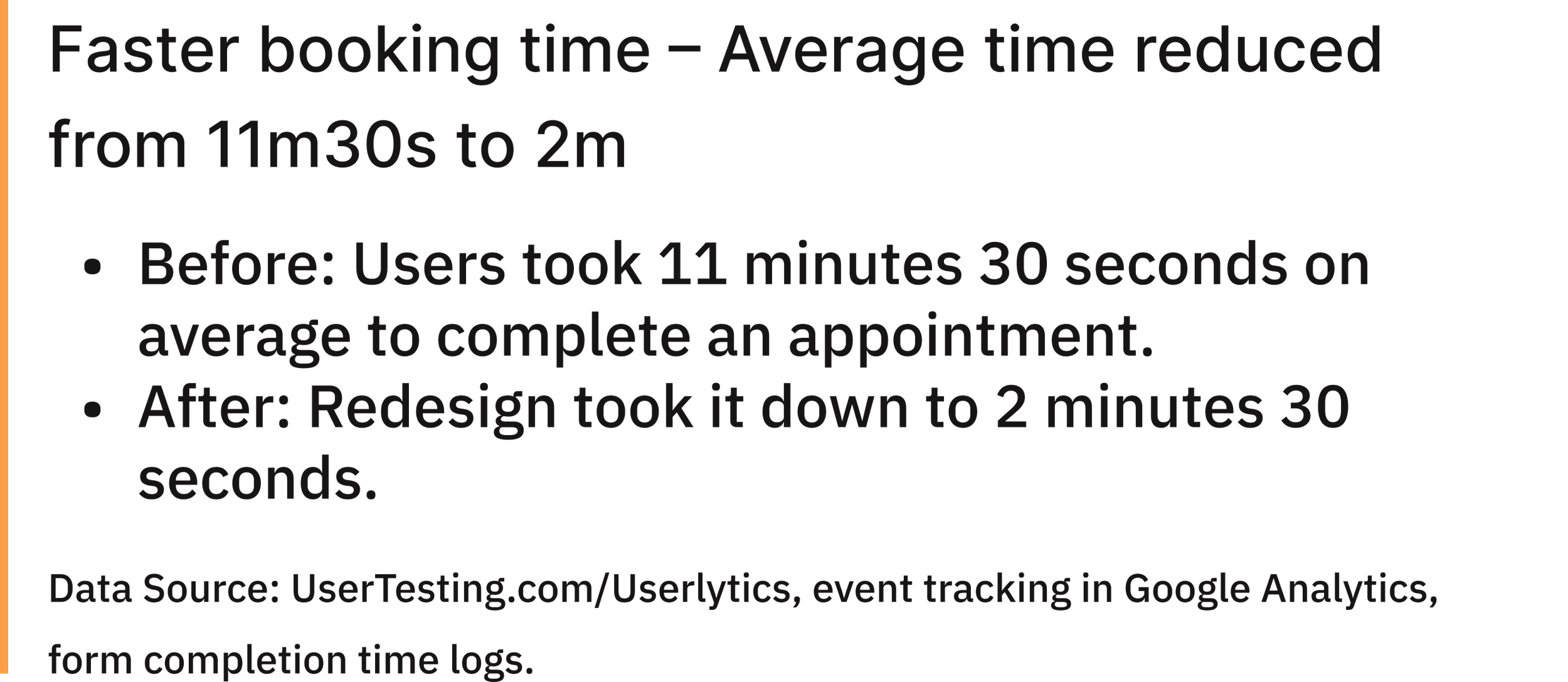
7/10 took over 1 minute to schedule a virtual visit and 3/10
took over 5 minutes!“A lot of questions are asked prior, I hope this means I spend less time at the Dr.’s office”
“I’m confused with the cost, because it says online costs $75, but video costs $75 too..so is that 150?”
“What the hell do I click on if I want to schedule a virtual visit, and not start one?”
Version 1
Version 2 of CTA Buttons
28.45% increase in virtual visit CTA clicks after A/B testing clearer button labels.


9/10 took less than 45 seconds and 1 took under 75 seconds
Stronger Impact on Virtual Visit Clicks
Limited Impact on Actual Appointment Completion
Clearer CTA Copy Improves Click Engagement
Clicks on left CTA: +3.5% @ 87% statistical significance
Clicks on right CTA: +11% @ 92% statistical significance
Appts Completed: +3% @ 55% statistical significance
Version 2

Old Scheduling Flow

New Scheduling Flow: 4 steps to book a visit!

Corner cases + cancel/reschedule appointments

Results Summarized